Interface transformation
Gradually, from the MVP stage, we are approaching a full-fledged release of the product, so we are rebuilding the interface and saturating it with details. I go through the flow and see where we got fails in the user’s path.
For example, we did not complete the flow or overlooked the situation where a double pop-up happened.
We have finished branding and soon the landing page will be launched. It remains only to match the platform with a new style.
I will show a few examples of what it means to “saturate the interface”.
Projects
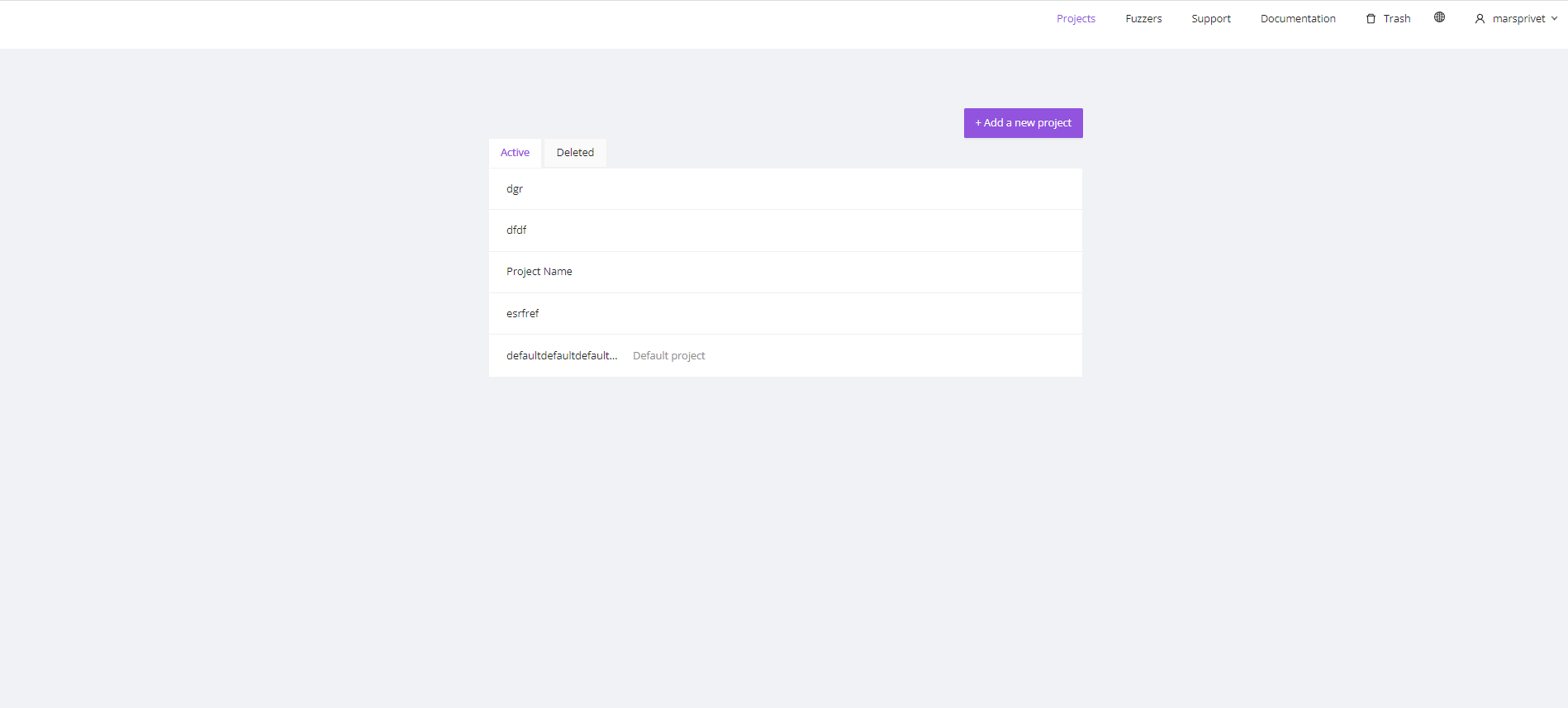
At the MVP stage, the “Project page” was nominal, we did not interact with it, we just wrapped fuzzers in it.

We have redesigned the “All projects” page. The «Deleted» tab turned into the «Bin of projects» link.

We pasted an intermediate page «Project» between the «All projects» page and the «Fuzzers» page.
The Project is a new page, on which users will administer it. They will be able to monitor the capacities in the project, manage all the fuzzers from one page, and monitor their status and state. In the future, users will be able to transfer fuzzers from one project to another.

Another example:
Integrations
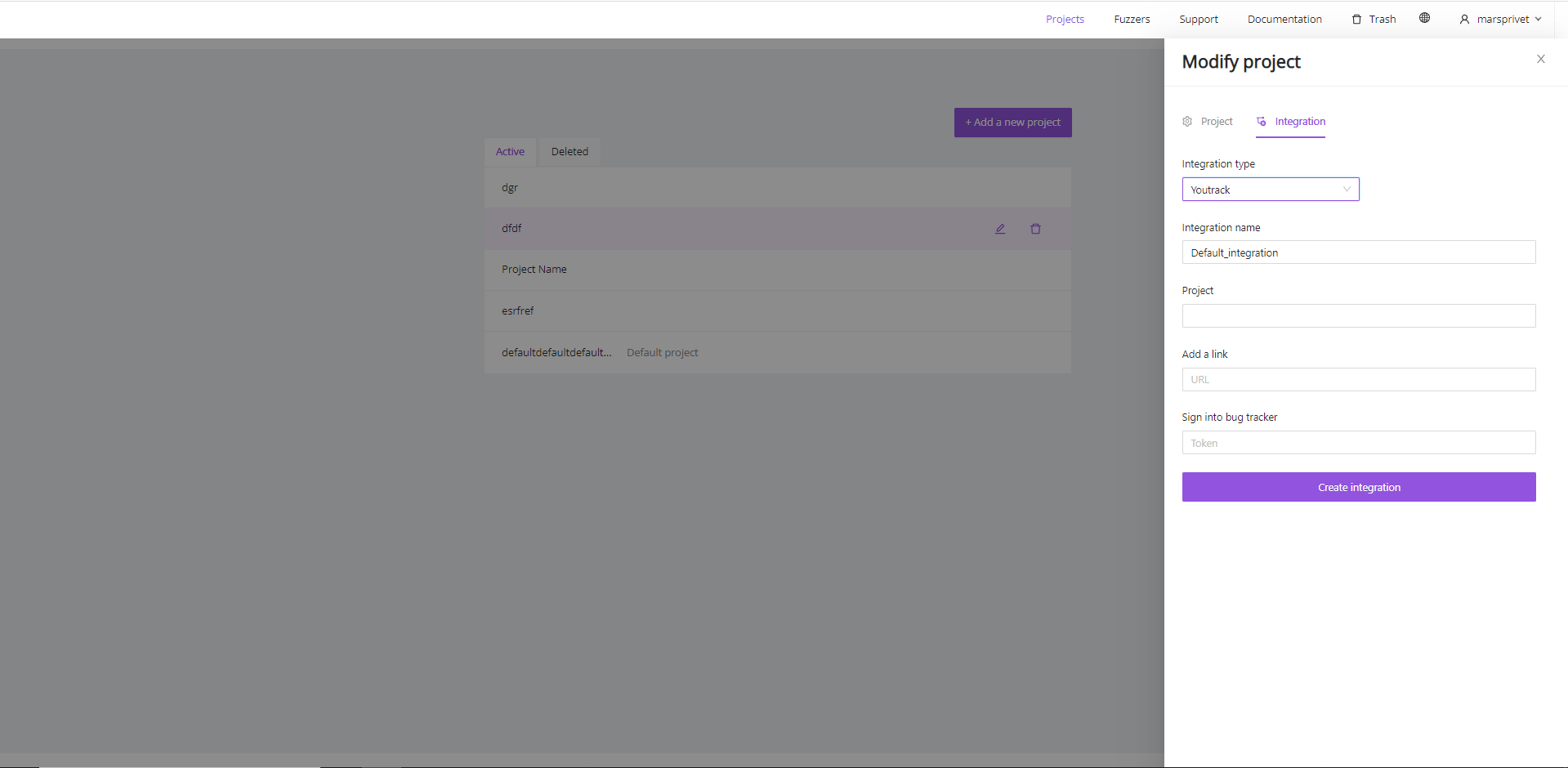
Integrations are settings for notifications about the status of the fuzzer, its crashes, and other important events of the project.
You can set up a project so that all notifications for it will fall directly to Jira or Youtrack.
This page didn’t exist before. All needs for it were closed by a drawer (haha, pun).

The platform didn’t have «All integrations» page. It was believed that one Integration was enough. But user cases have shown the opposite. Some people need several integrations: so that the bot writes in Telegram if something happens, for example, the fuzzer stops.

We added «All integrations» page. Now the project can contain several integrations. Users can turn them on/off, edit and make two-way integration — this is when some tasks for a fuzzer can also sent from Jira.
New system pages
We have added system pages. There users can change their passwords, set up system notifications in the application, and switch to another tariff plan if there is not enough capacity


Style
We have changed platform colors to new ones, the font to a corporate one, and added illustrations to the pages of empty states.


Problems
During the usability testing, several problems were found:
- We don’t have keyboard navigation at all. This is a big disadvantage for our users. We are thinking about how to implement it now. The advantages of mouseless are well described here (in Russian)
- The problem of identifying an icon without a label. A question of semantics, for example, the edit icon was indicated by a gear, although its function was purely editorial.
